Making a good and high-converting landing page is not rocket science but it does take some work.
You need to learn how to make a good landing page that gives the customers what they want. That means going beyond simply designing something that “ looks good. ”
So how can you clarify the process and unleash your landing page, to the amazement of the world that is watching you?
Well, XDimension has got your back!
What Is a Landing Page?

The purpose of a great landing page is to increase conversion rates in order to reach your marketing or business growth pretensions.
A landing page can be your homepage or another page within your taxonomy, or it can be a standalone page created for a specific campaign, sale, or product.
When it comes to a high-converting landing page vs. a homepage or other page your visitors find through a search engine, people frequently get confused.
It all comes down to how they find your page and why the page exists in the first place.
People frequently find homepages through word of mouth or social media, while landing pages are frequently set up organically, using keywords and high-ranking search results.
Each page has its own purpose to inform, to act as a gateway to the rest of the point (as in your homepage), or for a number of other reasons.
What are the Benefits of Effective Landing Pages?

There are a few benefits of effective landing pages, beyond increased conversions.
Getting SEO Ranking
High-converting landing page is crafted to target a specific set of search terms. They’re also promoted using Google Adwords and other paid boosting methods.
Both of these move the landing page up in ranking and get your product, promotion, or sale in front of people searching for similar topics.
Promoting an Upcoming Product or Sale
A landing page focuses on one promotion, product, or sale. It lives outside of your site’s taxonomy and exists solely to get one message across.
This is good in a few ways:
- It moves one specific sales or marketing goal to the foreground for higher conversion
- It gives you the opportunity to track the success of a particular product, goal, or set of keywords.
Make the Buying/Subscribing Process More Efficient
A high-converting landing page acts simply as a portal to move visitors down the funnel more efficiently. Rather than people stumbling upon your CTA somewhere in your right rail or on your homepage, they find it right away on the landing page and move on to subscribe, sign up, buy, or join.
The Truth About Good Landing Pages

It’s important to note that there’s no standard manual on the creation of a perfect landing page.
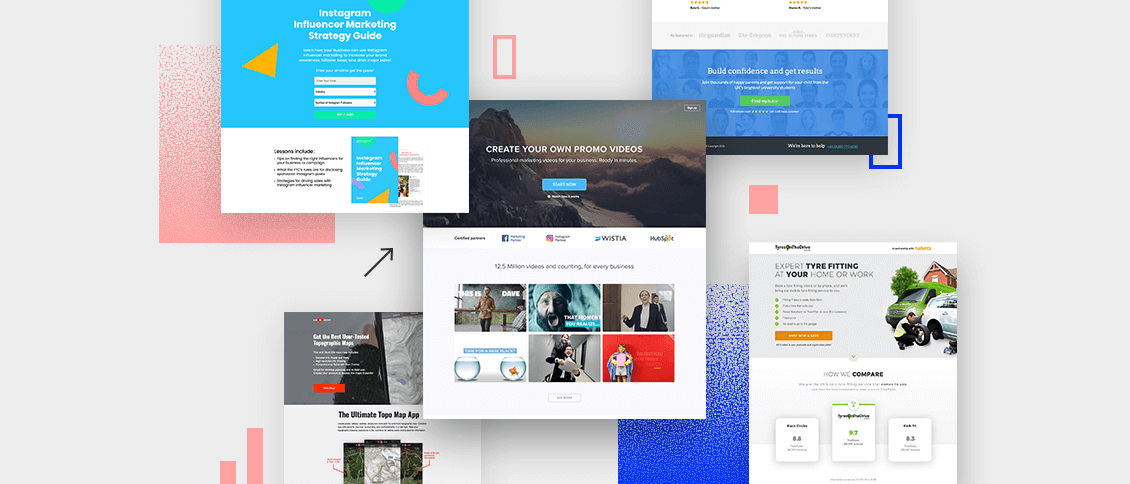
Landing pages that convert are as different as the people looking at them. Each one has a different call to action to drive, a different reader in mind, a different product or service to offer, and a different niche to address.
For example, consider these three scenarios:
- One landing page is inviting in-house marketers to a two-day conversion conference in Toronto.
- Another landing page is directing parents and students towards college applications.
The page design that works for any of these three is unlikely to work for either of the other two.
That’s because there’s an incredible amount of variation among their audience, purpose, intent, product, angle, focus, industry, niche, perception, buy-in, cost, messaging, value proposition, and testimonial approach.
So one size does not fit all.
However, there are various elements that characterize highly successful landing pages. We want to give you the closest thing to a magic bullet possible with these tips.
Despite the huge potential for variation, some things do remain constant. High-converting landing pages often have these characteristics in common.
How to Create a Landing Page That Converts?

Before you even begin putting together your landing page, you need to determine what you want it to accomplish.
Are you looking to grow your email list? Promote a new product? Promote a discount on a subscription service.
Once you have your goal, think about what your message will be. How can your offering — whether that be a subscription for content, an email list, or a product — solve someone’s problem?
Then you can start your keyword research. What do people type in when they’re searching for solutions to the problem that your sale, product, or newsletter can solve?
Once you have your goal, message, and keywords, you can start putting your landing page together. Start thinking about the elements you want to include: a CTA, a sales pitch video, or maybe a form.
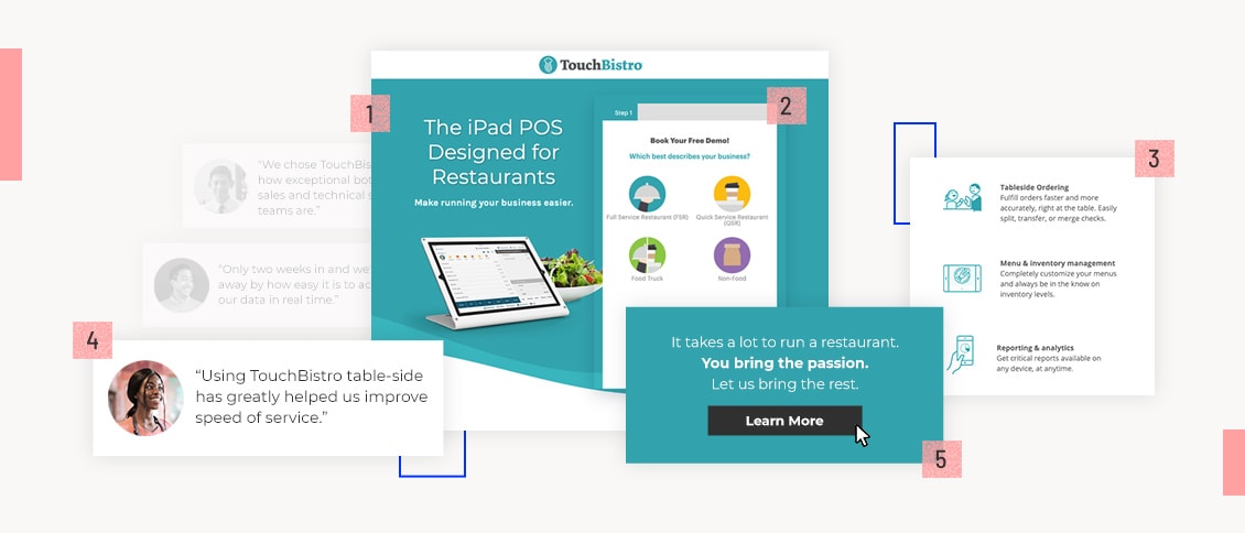
All effective landing pages have five common elements. Let’s take a look at each of those elements in detail.
5 Essential Landing Page Elements

1. A Killer Headline
A headline is where everything begins — interest, attention, and understanding for top converting landing pages.
It’s what compels a visitor to stay and learn more about what you’re offering — or not.
Here’s what it needs to accomplish:
- The headline should grab the reader’s attention.
- The headline should tell the reader what the product or service is all about.
- The headline should be short. Never make it more than 20 words, and preferably limit it to 10.
- It’s also worth noting that if your headline complements an image that explains the product or service, then you don’t need to go into quite as much detail in the copy.
2. Persuasive Subheads
The next element you need to create an effective landing page is the sub headline.
If the headline makes the visitor look, then the sub headline should make them stay. Together, these pieces of copy make up the one-two punch of a landing page’s power.
Here’s what to keep in mind as you create yours:
- Normally, the persuasive subheadline is positioned directly underneath the main headline.
- The subheadline should have some element of persuasiveness.
- The subheadline can go into slightly more depth and detail than the main headline.
3. Pictures
Visual content is an essential component of landing pages that work.
In fact, the brain processes images 60,000 times faster than text. This means that visitors will be affected by the images on your landing page immediately.
So as you select and place your images, remember that
- The pictures should be large.
- The pictures should be relevant to your product or service. If you are selling a physical product, it is essential that your landing page contains an image of the product.
- If you are selling any digital marketing service, the primary purpose of the image should be to grab attention and demonstrate relevance to the visitor.
- The pictures need to be high-quality.
And as you determine what to include, keep the focus on high-quality, relevant visuals. This is not the place to feature stock photographs or last-minute Photoshop jobs.
4. An Explanation
Your landing page needs to make what you’re offering perfectly clear.
After all, if a potential customer doesn’t understand what your product or service is about, you’ve lost them. So a straightforward explanation is important.
If your landing page is for a simple product or service, you might be able to get away with your headline and subheadline being the only copy.
But regardless of how you choose to approach your explanation, here’s what to keep in mind as you write it:
- Your explanation can be integrated with your headline, or completely separate.
- An explanation should be benefit-oriented. Explanations are functional, but functionality should be tilted in favor of the user.
Is your business legit?
Then make that clear on your landing page.
Some of the most persuasive landing pages have multiple methods of contact, including a phone number, a physical address, an email address, and a contact form.
Some even have popups where a customer service representative asks if they can be of help.
These go a long way to help strengthen the trust in the company and to eliminate any friction in the conversion funnel.
Here’s what to keep in mind as you add contact information to your landing page:
- At the most basic level, provide some assurance that you are a real company. Usually, this involves a physical address and a phone number.
- Live chats featured in a popup can be helpful, but not a must-have. Using live chat is somewhat controversial. If you insist on using one, do your homework, and make sure you have some convincing reasons for keeping it there.
To create high-converting landing pages, you can contact XDimension, your expert guide to attain all your desired goals.

